The challenge is to present team figures in a way that demonstrates the granular nuances that are often lost by merely quoting totals or differentials.
It has also been accepted that how a sides expected goals is spread over their chances also impacts on the results they achieve. A side that takes lots of low quality shots compared to fewer, better quality opportunities is trading the chances of an occasional headline grabbing goal glut for a more regular diet of lower scores.
The latter being preferable in a low scoring sport such as football.
A cumulative expected goals figure lacks granular data, while a full blown, chance by chance simulation reveals more, but is time consuming unless automated.
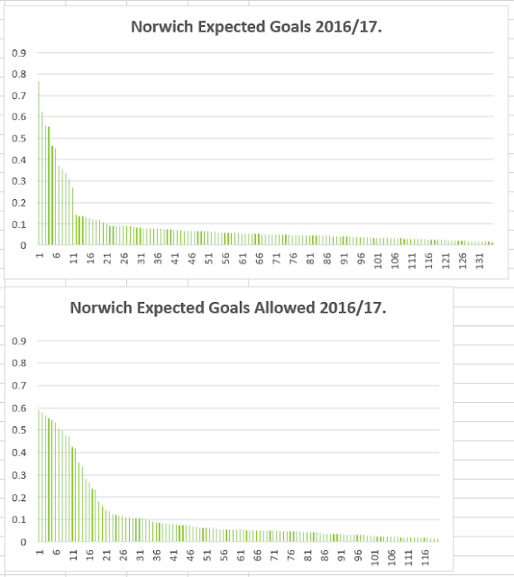
A decent halfway house is to plot the expected goals figures for each non penalty chance created and faced by a side over the season to date.
Scaled appropriately, the fatness of the left hand side of the plot shows the level of high quality chances a team has faced or made, while the length of the x axis illustrates chance volume.
Here's Newcastle, 11 games into their Championship season, out chancing their opponents with a long x axis and bulking up on good quality chances, while denying opponents the same luxury.
The highest quality non penalty chance they have conceded has a goal expectation of just over 0.4.
It's less rosy over 11 matches for fellow relegated side, Norwich who have allowed opponents a decent number of good quality chances and leaders Huddersfield currently profile more like a mid table team, such as Wolves.
At the bottom, Rotherham are currently being swamped by shot volume of fairly high quality, while offering little in return.


No comments:
Post a Comment